Saturday, December 25, 2010
breaking free
gouache on illustration board, 11.5" x 14"
pomegranates apparently symbolize society, fertility, and death. provocative mix!
this is my first time using real gouache. i really regret exchanging that windsor newton gouache for holbein acryla while at RISD ... acryla's basically gouache without the best part: the ability to rewet old paint. so now i have an expensive thing of acryla that i have little use for.
but i digress. gouache is ridiculously hard to blend but i think it's an interesting medium in it's own right. i think i actually prefer it over acrylics...
Friday, December 24, 2010
mixed media
more ryman stuff. both drawn/painted from life. typically my process is to draw with prismacolor nupastel (basically colored pencils except in stick form without wood and stuff) and then work mixing watercolor and chalk pastels. nupastel shows up through the watercolor, so it's interesting to see the freedom of the preliminary line. throughout ryman, david has been pushing me to really break free from my usual 'tight' style.
the former was done in class in the span of ~3 hours, the latter out of class for homework for about also ~3 hours (minus breaks). david really liked my dumpster, but i think he just has a thing for trash (literally).
Monday, December 6, 2010
watercolors and denise
just some of the work I have been up to lately. My RymanArts semester with David ends next Saturday which means I won't be taking another art class until mid February. The only plus to this is now I can focus on my college applications and their respective hometests.
water color quick sketches 5-10 minutes each
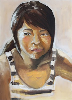
two takes on this girl in my art class, denise. the first I did in my sketchbook in a contour style illustration and the latter is an oil painting (oil pastels for the drawing and then oil paint on top) with a solid red ground. i was rummaging the classroom for some scrap material to paint on and i found this really old and dusty canvas painted all over in bright red. i think the kid even stretched it themselves since the canvas had a lot of give ... in any case i just went at it. painting on top of oil pastel is a really interesting experience, the pigment was really thick but definitely not in a bad way.
Tuesday, October 26, 2010
RymanArts figure drawings
I started taking art classes through RymanArts this fall on Saturdays. It's quite a far commute from my house, but sooo worth it. It's really nice to get some regular studio hours in my life. Plus, it's completely free (including supplies!) and by luck I'm learning under my CSSSA painting teacher!
He is, beyond doubt, one of the best art teachers I have had. I definitely feel myself growing loads, not to mention this is my first exposure to pastel. His class has given me a whole new way to look at drawing the figure, one that is no longer based on the objective of trying to get down the figure as quickly and compositionally pleasant as possible, but rather one that seeks to understand the components that capture both a person's characteristics and his/her collective humanity.
2 minute poses
5 minute poses
10 minutes: 30 second pastel ground, vine charcoal contour on top (except no ordinary vine charcoal ... a vine charcoal attached at the end of a long stick so you reaaaally loosen up), and then more pastel.
10 minutes: same as above
3 minute poses: quick pastel underground, 6B graphite, and then a different color to define forms
50 minute pose: lots and lots of pastel layering
Saturday, October 2, 2010
CAI figure drawing
some figure drawings from CAI during my 2nd semester sophomore & 1st semester junior year.
Friday, October 1, 2010
is this all (risd basic design final)
(click to see larger size!)
done with permaopaque markers on acetate. the assignment was an artist book, aka free reign to make anything i wanted in book form.
i had many ideas revolving around the idea of communication. since communication was a central theme in my personal exploration at risd (ie: the relevance of art and how much insight an artist is able to impart to modern society when art is undervalued), i felt like it would be fitting as a final project. a few of the other ideas i was thinking dealt directly with the perceptions of a viewer at a gallery versus the artist's intent while they were making the work, and it would involve a lot of cut outs and pull outs and it was complicated and i didn't like the idea of making my own "masterpieces" to fill the walls of my fictional gallery ...
so this is instead what i chose to do. it comments on the superficiality of communication: when we speak to people, we don't truly know who is the person we are talking to. we fill conversations with small talk, but we don't get at the essence of another's character. moreover, a lot of what people say intends to hide their imperfections, and we as people end up conforming to our fears of vulnerability.
the first sheet of acetate (after the cover) is just a line drawing of my entire face, flipping it begins the "revealing" (both physically and symbolically) of myself. each subsequent sheet of transparent acetate is a different part of my face, except instead of drawing it out, i write a sentence about that feature. the statements are things i don't really tell people about myself but is nonetheless revealing of who i am/was as a person. the final sheet is just the pupil of my eyes with "you see", which can be construed as "you finally see who i am" and as the end to the question (connecting with the title of the book) to read as "is this all you see"?
while presenting to this to my design class i felt my voice quivering a bit. it's funny, it turned out a lot more personal than i thought it would be. i haven't really shown this to people back home either. so i guess that means no matter how open and ready i feel myself to being vulnerable, part of me is still holding back...
when viewing in person, each page takes a while to flip since the book is a bit shaky, being sheets of acetate bound by too-big rings and all ... I actually enjoy that it is shaky. I don't see it as a flaw of the book. It takes longer to flip each page. It makes you pause, and think after each slide.
i owe a lot of the successful results to my friend Gavin, whose discussion throughout the process really helped me come to fleshing out each slide. :)
COVER: is this all
1. full face line drawing
2. hair: My entire family gets their hair cut by my mom. I was fourteen the first time someone other than my mom cut my hair. The hairdresser speaks only chinese so he ruined my bangs; they were too short.
3. face shape: I used to tease my older brother about his acne, forgetting that we share similar genes.
4. ears: My mom refuses to let me pierce my ears.
5. nose: I have always hated my nose.
6. eyebrows: When I was little I plucked with scissors.
7. eye shape: At age eight, my aunt offered me double eyelid surgery.
8. lips: One tooth grew behind the other. I still don't smile much.
9. pupils: you see
Wednesday, August 18, 2010
mmmm
risd pre-college foundation drawing work
in terms of technical/rendering ability, i don't think i've improved much from the class. but the real value came from exploration of material (ie: ink and drawing utensils with ink) and style (ie: i fell in love with the look and process of contour drawing). it was interesting doing highly refined and controlled work (like the 30 something hours i spent on the trompe loiel assignment, the still life with the camera) and then just ripping loose with ink on the last few figure drawings. i'm usually the type to be incredibly controlled and precise with my drawings, but what i lacked was an ability to shut off my rational brain and let my art instinct fly. perfection of rendering is incredibly limiting; the process of producing work in that style is just psychologically mind-numbing... my creativity dulls and it becomes easy to lose the vigor of a love for drawing. i'm happy to report that, that vigor .... wellll it's baaaack! :D
Tuesday, August 17, 2010
oil painting is fun!
this isn't everything from my RISD pre-college painting class, but most of it. i left out a landscape (ugly), the first black and white study we did (boring), and our first still life (blurry photo).
1. Limited Palette fabric study. 16" x 20"
I used two tubes of paint: yellow ochre and dioxane purple, plus permalba white
6. self-portrait 11" x 14" assignment was to do a painting with the toned ground poking through. it didn't work so well for me because the toned ground was a yellow ochre/burnt umber mix and it was too similar to my skin tone ... regardless you can see portions of the toned ground in the face, especially the nose and forehead
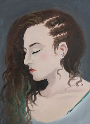
7. "Sierra!" 11" x 14" Portrait of my roommate :D The assignment was to do a flat painting, ie: Alex Katz's style
9. model study 16" x 20"
10. Self-portrait w/ symbolism assignment. 18" x 24" this is probably my favorite painting i have done thus far (though i don't think that is saying much). it speaks of my ambitions as an artist. with my artwork, i want to "paint" the audience; i want to change the viewers' perceptions of a topic furthering awareness of social problems or social phenomenon. in essence, i intend to make art with social concern. the painting also hints at perhaps the folly of my goals: in thinking too much about the viewer and the message i'm trying to convey, i end up ignoring the actual painting i'm working on. this manifests often in my work through shitty paintings: banal ideas, and technical (not creative) execution.
11. Self-portrait. 12" x 24" this is a continuation of the previous in that the former is about my goals as an artist, and this one is about my fears as an artist. i fear dying and having produced no significant work, being inconsequential and suspended in time's continuum with no impact on the world. i had more fun experimenting in this one (working on a slightly wet phalo blue toned ground and playing with skin tones, and leaving it with an "unfinished" feel) but i don't like the result in this one as much. i felt so drained while painting it, i kind of gave up (doesn't help that i did the majority of this after midnight the day it was due ahahah)
Friday, June 11, 2010
ugh never draw when you're not in the mood
i killed it. ugh ugh ugh ugh. the thumb on the left hand .... i hope i can ask for it back to fix it ... i like the hand on the right quite a bit; i'd like to use this piece for my portfolio/art supplements.
not done, but i have to submit for this application for an art class and i'm outta time sooo ...
in other news, dug this one up for my application, tweaked it up a bit, cropped it in art class today. i quite like it for something that's from my pre-csssa days :)
Monday, May 31, 2010
slip on the red shoes and dance
work in progress. extended hand study building off of 'glide', finally :) i'm working on numerous pieces at the moment; they'll be done within the next couple weeks. huzzah productivity!
i dunno if my whole cardboard series is going to go into fruition, the series sort of disappointingly died under workload, stress, and personal life concerns. i have a couple sketched out that need to be finished, so we'll see. maybe i'll just truncate the whole thing at five pieces ?
Subscribe to:
Posts (Atom)